The completion of the Preston Bypass provided some useful lessons in motorway signing.
Firstly it was realised that mounting signs on scaffolding was a bad idea – the final report even goes so far as to describe them as “frankly temporary”, and the more familiar tapered concrete supports that lasted until the 1990s developed from this point.
The second lesson was that the signs at Preston were perhaps too big, and modifications to the emerging Transport typeface and layout of motorways signs for the final report allowed space to be saved without a loss of legibility. It is interesting to note, perhaps as a dig at design rival David Kindersley who had been pushing his serif typeface for signs (it later became adopted for street name plates), that the report stresses that lower case lettering is mostly a matter of aesthetic taste but they’re sticking with it, as the advantages over all-capitals were minimal with x-heights of the size given.
It also established that given the then relatively limited availability of reflective sign sheeting that illumination of direction signs should be standard. The design, pioneered by the Road Research Laboratory, featured floodlights angled up towards the sign. At Preston these had their own posts, but the new tapered concrete supports introduced cantilevered arms for the lights. Whilst certainly a tidy looking installation, these arms would go on to be known as ‘death prongs’ as if a vehicle collided with one the cantilever arm would destroy it and usually kill the occupants within. By the mid-1970s sign lighting was on its own posts in front of the main sign once more. As ever, highways design seems to go around in circles to get back to the original idea…
The general public never had access to the Interim Report that detailed traffic signs for the Preston Bypass. A seven page press release summarising the salient points, but without illustrations, was circulated by the Ministry of Transport and Civil Aviation, and numerous photo tours were taken by media outlets to explain what these new signs were.
Remember that the main thrust of the motorway signing system was to be the ease of navigation for road users. This called for large characters as was being developed in California and Germany at the time. However, the Interim Report did not want to overhaul signing for all-purpose roads, instead visualising that motorway signs would be distinct and use scaled down versions off the network, which is a similar concept to what Germany still uses today.
Unused Part of The Interim Report of the Anderson Committee (1958)
Unlike the later final report, this document was not intended for public circulation so it never had anything other than a simple green cover page and was printed in monochrome. Much of the design consideration and content was referred to in the previous chapter, but there are is one interesting section that did not see use.
Route Confirmation
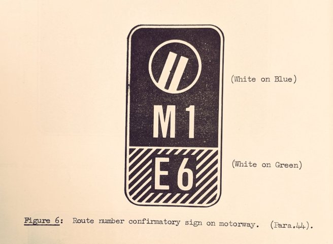
The Interim Report came up with this as a route confirmation sign for use in a central reservation. The final report removed the motorway symbol. The Preston Bypass was ultimately deemed too short to require the central signs.
As noted elsewhere, there has been provision for signposting the European Route Network on motorway signs in the 1975 and 1981 TSRGDs (it was not in the 1964 edition, despite the Anderson Committee advocating it).
The M1 didn’t follow much of the guidance
As the report wasn’t ready when the M1 opened, further experiments took place from Preston that shaped the final report.
Subtle differences included the merge sign using a barbed arrow instead of the fish-hook style later recommended, this was deemed to be ugly (and in the case of the M10/M1 merge it also misled!).
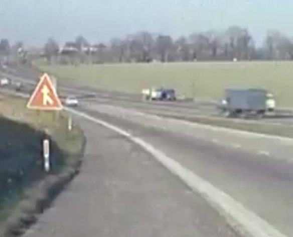
This sign implies a right hand entry but it was supposed to symbolise equal prominence of merging. The Anderson Commtitee didn’t like it and changed it later. Photo Credit: British Pathé
The Final Report of the Anderson Committee (1962)
The final report took some time to be released, and by the time it was in general circulation the motorway network already had hit the 200 mile barrier. It would therefore not be too harsh to suggest that the first lengths of motorway to open were nothing more than living experiments where signage was concerned. However, many of the principles of this report still live on to this day.
One thing the report did which, at the time, was a huge shift in policy was to remove the prominence of route numbers over places. This was trialled at Preston, where the route number was in a prototype Motorway typeface but the letter height was matched to the regular text meaning that it appeared too small in comparison. The final report rectified this and the Motorway typeface as we know it came into being.

A copy of the final report showing full colour illustrations of the signing system. Photo: Google Images
The Motorway Symbol Battle Rages On
The committee was still unconvinced by the European motorway symbol. Their main objections remaining as the fact it was too tall to use on regular signs, and would only work if used as a standalone sign. The symbol that had been trialled at Preston, which in the committee’s opinion had suffered ‘frivolous’ criticism in that the symbol suggested the motorway just came to an end was redrawn and given a new appearance. The committee agonised over this point and threw the ball back at the Ministry of Transport.
The options were laid out as follows;
- Use the modified symbol based on experience at Preston;
- Use the European ‘stretched’ symbol;
- Use the modified symbol;
- Don’t bother with a symbol – which was what had been done on the M1 because of time limitations and the need to actually install some signs.
The circular abstract symbol therefore pretty much never left the final report and the now familiar symbol stayed hidden in the background until the late 1960s when experiments with it began. However, this posed a particular problem as the committee felt the signs that listed prohibited classes of traffic from motorways were too verbose and should not be seen as anything other than a temporary measure whilst the general public became acquainted with the concept of these new roads. Somewhat surprisingly, the committee had perhaps naively not considered that ‘temporary’ in British government parlance usually means several decades. It would be 1975 before the prohibition signs were replaced with what we take for granted today.
It is also interesting to note that the report suggests the symbol could have been used as a way-marker from distant points – something done in France and Germany today. Right up until 1994 (and beyond where designers have failed to read any literature about sign design) it was possible to see direction signs refer to “Motorway” as a destination in its own right, either on standalone signs or as part of a bigger assembly. What happened in the end is the symbol became used a means to show that motorway regulations were in effect from that point beyond.
The symbol issue also resulted in the interim report suggestion of using colour panels for the entry to motorways being ditched in favour of all-blue signs. This is in turn also resulted in sections of A-road upgraded to motorway standards ending up getting the horrendous Ax(M) designation because without a symbol there was no other means to show on an advance sign that the road ahead was subject to motorway regulations.
Another fine British policy fudge had been born and one we’re now stuck with as the two of the main motorways in the UK (the A1(M) and A74(M)) have plainly ridiculous numbers that no-one understands all because of a disagreement about a symbol design way back in 1958. If you’re interested in the sheer panic this caused the Ministry, the excellent Pathetic Motorways site has the full history.

No mention at all that this is the M2, and no symbol, but because it is a blue sign under the Anderson Report you therefore knew it would be a motorway. Photo: I-Spy On The Motorway (1972)
The net result of this was the report had no choice but to continue recommending the list of prohibited vehicles. The M1 and A20(M) broke with what the report suggested and went with “Prohibited on motorway” on the top line instead of “Motorway” and an enlarged “NO” below it adjacent to the list.
The Wonky Sign Finalised
The report retained the slanted ahead arms on fork signs, mainly as a means to break up what would otherwise be an expanse of blue nothingness, and also because they liked the perspective effect it created.
The simple and elegant appearance of the fork signs cannot actually be understated. Whilst a definite product of their time, these signs would still be perfectly legible today.
Looking at the above mock-ups it is perhaps hard to disagree. This would represent a more cluttered example, the report is very strict in saying it prefers only one or two destinations per exit, and likewise a single ahead destination.
Fractional differences
Another interesting change is how the use of fractions developed. On the signs at Preston the fraction was presented vertically, with the numerator above the denominator whilst a horizontal vinculum was used. In order to massively reduce the size of the half mile advance sign, the final report replaced this with offset numerators and denominators aligned horizontally with a diagonal vinculum. However, the dimensions still meant the fraction was substantially larger than the “m” adjacent to it. In 1964, the vinculum was dispensed with altogether.

How space is saved by careful positioning of fractions.
Cloverleaf Considerations
Whilst much of the report is focused on typical signs you’d find, one situation cropped up that had not yet been tested – how to signpost motorways that crossed, rather than merely terminated. The report discusses that this may be means of a cloverleaf junction (none were ever built on motorways in the end), which would require a mix of overhead and roadside signs. Interestingly, the roadside sign forms two exits in succession which it suggested may also be used at closely spaced junctions. This wasn’t actually codified in the regulations until 1975 so none of these unique Anderson signs were ever erected.
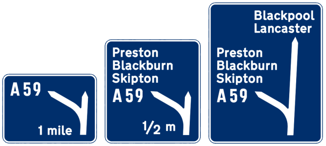
Why oh Y
The Anderson Committee also encouraged the use of “Y” map signs at the approaches to major motorway junctions. They reasoned that the diverging routes deserved equal prominence. These types of sign again weren’t prescribed in any subsequent regulations but stacking of destinations carried on – particularly in Lancashire – by simply applying guidance for all-purpose road signs and getting site specific approvals to use them on motorways.
Today it would be expected that either lane allocation signs or gantries would be used. The final “Y” sign to be erected in Lancashire was on the M65 approaching J9 in 1984, where the trunk road diverged from the motorway and therefore the exit was afforded equal prominence even though it really didn’t deserve it.
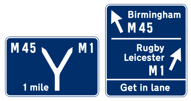
This junction originally used a modified fork sign for the 1 mile information as it was felt that traffic heading to Birmingham needed extra warning that you had to leave the M1 to get there.
Merges were equally as important – warranting worded signs and red triangular signs at the final merge point. The red signs did not last long beyond 1964, being replaced with conventional warning signs to the new Worboys standard, but the worded signs lasted well until the 1990s, despite never being prescribed in 1964 onwards. The final Anderson era “Motorways merge” sign was only taken down on the M6 in 2002!
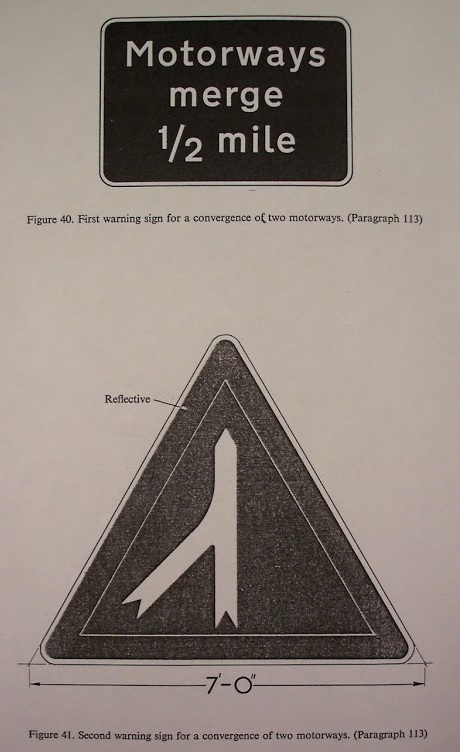
Merge!
One that is not in the report!
The Anderson Committee did not discuss warning signs for roundabouts at the end of motorways, instead insisting that the direction signs and End of Motorway signs would be sufficient. It appears not, as a red sign that is an obvious pre-cursor to today’s roundabout sign was introduced on several motorways.


These signs were approximately 200 yards after the End of Motorway 1/2 mile sign but in advance of the direction sign, to reinforce the point that the motorway is ending. The map would show the layout of the approaching junction.
Recorded Examples
Thanks to modern video sharing platforms, many old Super-8 type films are now available for public digest and as a result several video captures of Anderson era signs are around which simply weren’t a decade ago. Some of these captures from video are shared here to give context of what Anderson signs looked like out in the field.


Some selected Anderson signs in the 1960s.
Stay tuned for more on Anderson and the move to the Worboys system of motorway signs.

The roundabout reduce speed now sign survived on the M1 in NI until the 1990s despite the motorway being diverted onto a bigger roundabout with more than three exits.
LikeLiked by 1 person
I’d not noticed the demise of the Motorways merge signs! Yet also, I always wondered what was the big deal about it that needed signing.
LikeLiked by 1 person
For what it’s worth, a brand-new “Motorways merge” sign appeared on the M26 as part of some roadworks around 14 years ago. It’s still there today.
https://goo.gl/maps/1s6GcwVckkc2o4a39
If you want to see what the old concrete posts looked like, there are still some on the M2 around junction 6 (the eastern part of the M2 is like going back in time). And for the “full monty”, there’s a set of concrete posts and “death prongs” on the A278 at junction 4 of the M2 – that’s a link road to the A2, built shortly after the M2 opened.
https://goo.gl/maps/pKmLauJzFDyPxJcv8
The “death prongs” on the M2 itself lasted into the 1990s, as I recall.
LikeLiked by 1 person