Many years ago, in a former life, I wrote the following introduction to a guidance note for the effective use of road markings.
Road markings are one of our biggest maintenance issues. Thermoplastic wears off with continual traffic use and has to be renewed regularly. Worn markings make streets look untidy and can be a road safety problem as drivers can be mislead by them.
When roads are resurfaced as part of ongoing maintenance schemes, the opportunity arises to improve the road markings due to the ‘blank canvas’ effect a new surface provides. This document is designed to summarise the benefits of reduced clutter on public roads. As highway authority, it is poor practice to issue ‘renew existing’ orders on any resurfacing scheme without a review of what markings exist.
Continual review of road markings will maintain the public’s respect for them; simply leaving things as they are will erode that respect.
In urban areas, the temptation is often for lots of road markings to improve the flow of traffic by unlocking capacity. However, the application must be carefully considered as these roads are heavily trafficked meaning that the lines will need more maintenance than on quieter rural roads.
In rural areas, the over-proliferation of road markings has caused both ‘creep’ and urbanisation of the countryside. Organisations such as the Campaign to Protect Rural England are opposed to road marking schemes that have an adverse impact on the visual amenity of our rural areas and therefore design should always be sympathetic to the environment in which it is placed.
My opinion has not changed. Road markings are a critical, yet massively overlooked element of our road sign system. They immediately tell drivers where to go. They stop, at least in theory, an idiot from driving towards you on the wrong side of the road. They tell us where we can and can’t park.
However, they are misused often by well intentioned but misguided practitioners, and this damages their usefulness. The following is a list of things we do with road markings that we should move away from doing.
Misuse of Hazard Warning Lines
This is by far the utter worst problem we face where misused markings are concerned. Far too many examples exist where the hazard warning line is used to separate traffic flows. Chapter 5 is explicit in its meaning as to what this line is for; it is to denote a hazard! A straight section of road? Not a hazard. In fact, the misuse of these lines is now so prevalent that they hardly mark hazards at all; they are effectively just the centre line.
Why is this bad? Simple; drivers no longer have the visual clue that the road ahead is difficult that hazard warning lines were intended to provide. That means we end up putting up signs to convey a message the lines themselves would have been adequate in doing if they were used properly. The result is more clutter, more maintenance, and less informed road users. The only winners here are lining contractors, being paid by the linear metre.
It is simple. If the road does not have a hazard as defined by Chapter 5, then use a centre line marking. Not only is it far cheaper to do this, it is also correct design and your road users will thank you for being alerted to the presence of real hazards by the hazard warning lines when used sparingly.
Central Hatching
Another major example of misuse. This one is often done on ‘safety’ grounds, although the truth is that there is very little evidence to prove that hatching makes roads safer. It is often overused by practitioners who have read the Design Manual for Roads and Bridges, but not realised that is intended for high speed trunk roads, not the village high street. Hatching to separate flows on a single carriageway subject to the national speed limit is not the same as hatching to separate flows in a 30 mph area where parked vehicles are down both sides of the road.
Seriously, what does this achieve?
In my experience, hatching usually serves two purposes; to collect detritus, and provide reckless drivers with their very own overtaking lane. Meanwhile, everyone else is pushed towards the gutters which then immediately puts cyclists in an uncomfortable position. Drivers not fully clued up on the Highway Code will avoid entering the hatched area, especially if it’s coloured in a fetching shade of red textureflex (or similar approved…) material. This means the cyclist gets ‘pinched’, and the types of conflicts that end up all over YouTube occur.
Plus the sheer maintenance burden this stuff leaves puts it on my ‘don’t bother’ list. There is a lovely illustration in Chapter 5 showing tapered hazard warning lines approaching a traffic island. I always use this unless hatching is likely to have a tangible benefit (e.g. speeds are well over 40 mph and the extra reassurance is valuable).
In urban areas, hatching is usually scrubbed off the surface because the actual lanes are full of parked cars. What is the point of segregating flows in this manner when they have to foul the area you have intended to be kept clear? It defies all logic, and how these layouts keep getting signed off is beyond me.
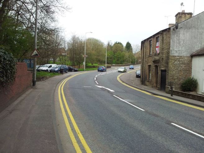
You can see where 1 metre wide hatching has been removed from the centre of the road here, reducing the maintenance burden but having absolutely zero impact on safety. Incidentally spot the pre-1975 ratio sign!

Hatching was removed to provide parking bays, meaning that vehicle scrub of white lines was reduced. Pity the red surfacing remained; but five years later this road was resurfaced which fixed the problem.
This said, there are situations where hatching is useful. If there are lots of side turnings, and parking restrictions, hatching provides a central turn lane and thus keeps the traffic moving. The risks of pinching cyclists remain, so care needs to be exercised when designing such layouts.
Narrow Cycle Lanes
There is just no point here, cyclists won’t use them, and they just annoy drivers. If a cycle facility cannot be properly designed, don’t bother at all. I won’t wax lyrical on this one, as virtually every other blogger out there has done it to death already.
Double White Lines
The use of double white lines was intended for rural situations where visibility was poor and therefore crossing the centre line was deemed a bad idea. Their use also prohibits stopping along their length. Therefore, when used in an urban area, you are often going to find that the road markings are ignored and people park along them.
The pinching of cyclists issue raises itself here once more, as unless a cyclist is travelling at less than 10 mph, you cannot cross the white line to pass them.
The maintenance burden is caused by the legal requirement to provide reflecting (or LED) road studs through the entire length controlled by double white lines, and also to manage the effects of scrubbing where indiscriminate parking has taken place despite a restriction being there.
The general presumption in urban areas should be that overtaking is undesirable, so the use of double white lines is superfluous.
Some other tricks to reduce lining maintenance costs
- Use 75mm or 50mm yellow lines. 100mm ones look intrusive and are just extra cost you can avoid. I have worked in authorities where 50mm and 75mm are the norm, and they have no problems with parking enforcement.
- Where there is no impact on safety, remove centre lines altogether.
- Use alternative materials for demarcating parking bays – this is allowed by TSRGD. Whilst there is a higher start up cost, whole life costs should be less as many materials never need replacing whereas thermoplastic does.
- Don’t lay markings in bad weather or in winter! It should be obvious, but a wet and cold road will never hold a marking. Deicing salts are also terrible news for lining. They’ll flake off in weeks if you lay them on this.
Ultimately, it isn’t for me to tell people how to do their jobs, but really if money can be saved with the benefit that the roads look tidier, provide the information in a better form, and generally follow good practice, then why is this not being done as standard?

Another thing to consider is to avoid putting destinations and even arrows on the road surface. All too often, drivers get caught out approaching a junction because they have to rely on road markings to tell them what lane to get in, and the combination of (a) limited space, meaning any destination more than 5 letters is abbreviated, (b) limited opportunity to see the markings in front of you, especially in heavy traffic, although even with a clear road you can’t see them from far away, (c) even more limited opportunity to see the markings in other lanes … even when the markings are new and pristine, they are significantly less useful to drivers than a roadside sign.
Add to that the problems of a wet surface often making road markings nearly invisible, and the inevitability of road markings wearing out over time, means that you are rarely in optimal conditions. In real-world conditions, road markings to indicate the destination and direction of each lane really is inferior to roadside signs, and should need less maintenance as well.
LikeLike
Double white lines: “Therefore, when used in an urban area, you are often going to find that the road markings are ignored and people park along them.”
I think most motorists don’t realise that parking is prohibited where there is a solid white line, and this ignorance is re-enforced by the lack of enforcement. It’s not covered by the civil enforcement regulations, and police tend to leave all parking enforcement to the councils – including the enforcement the councils don’t have the powers to do.
LikeLike
Fascinating to read your thoughts. One of my continual bugbears in my London Underground days was managing responses to demands to paint instructions on platform or floor surfaces – where not only do they add to visual clutter in an already complex environment, they wear out due to – ooh, passengers waking on them and yes, in peak hours when the reputed ‘need’ is most – you can’t see them because yes, people are standing on them. That’s before I get into the often ambiguous nature of what the markings are supposed to do, such as hatched boxes aligned with train doors on platforms. Ah – keep clear to allow exiting passengers off. Erm, so why are people standing carefully in them? Oh, they think that’s where they are supposed to wait ….. The safety issue around the top and bottom is escalators was another. I paraphrase; “People tend to trip and fall getting on and off escalators”. So by painting red boxes they know”. Hmm. Red means “stop” to lots of people and so what you get is hesitancy because you can’t avoid the red box. And often hesitation, even for a second, tends to lead to a situation where accidents are more likely to occur. I should have bought shares in thermoflex paint or vinyl sign manufacturing to bolster my pension. Keep it simple, pertinent and legible.
LikeLiked by 1 person