Blue borders. You either got them or you didn’t. These were a well intended, but extremely difficult part of the earlier TSRGDs to get to grips with. They also were all supposed to have been taken down by 31 December 2014, yet they are still everywhere (more on that later).
They threw both designers and members of the public. So what went wrong?
Origins
The concept of a blue bordered sign for local directions originated the early 1950s and were then introduced in the 1957 Regulations. Inspired by the reviews of London’s then awful traffic signs, the distinction between blue and yellow backgrounds at the time told drivers whether they were following a major route or a local route. This system eventually evolved to what we have today when the Worboys findings were put into the 1964 TSRGD.
The main classifications for direction signs have been mentioned previously in Direction Signs – have we lost our way?
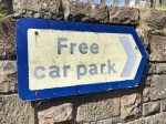
Local destination signs were, by and large, intended primarily for use in urban areas, and would generally direct road users to amenities such as car parks or railway stations. They could also include districts within an urban area that would not typically warrant an appearance on ‘main road’ signage.
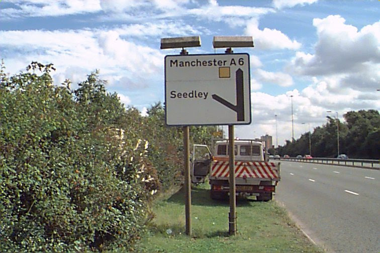
In 1964, the local destination signs were made more prominent in that they had a much thicker border than the corresponding signs for non-primary routes. This was a useful distinction, as it is far easier to determine a thick blue border from a thin black one at a greater distance. For the same reason, military signs with red borders also used a thick red border.
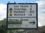
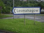
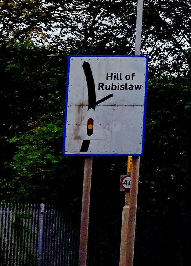
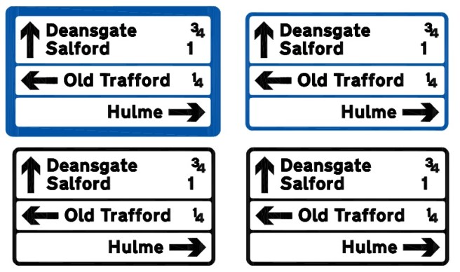
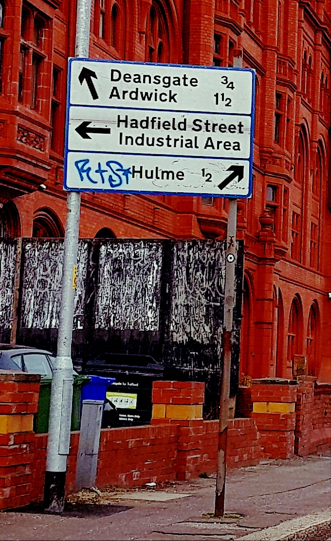
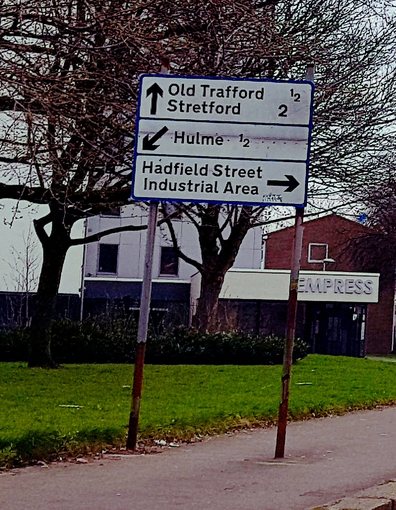
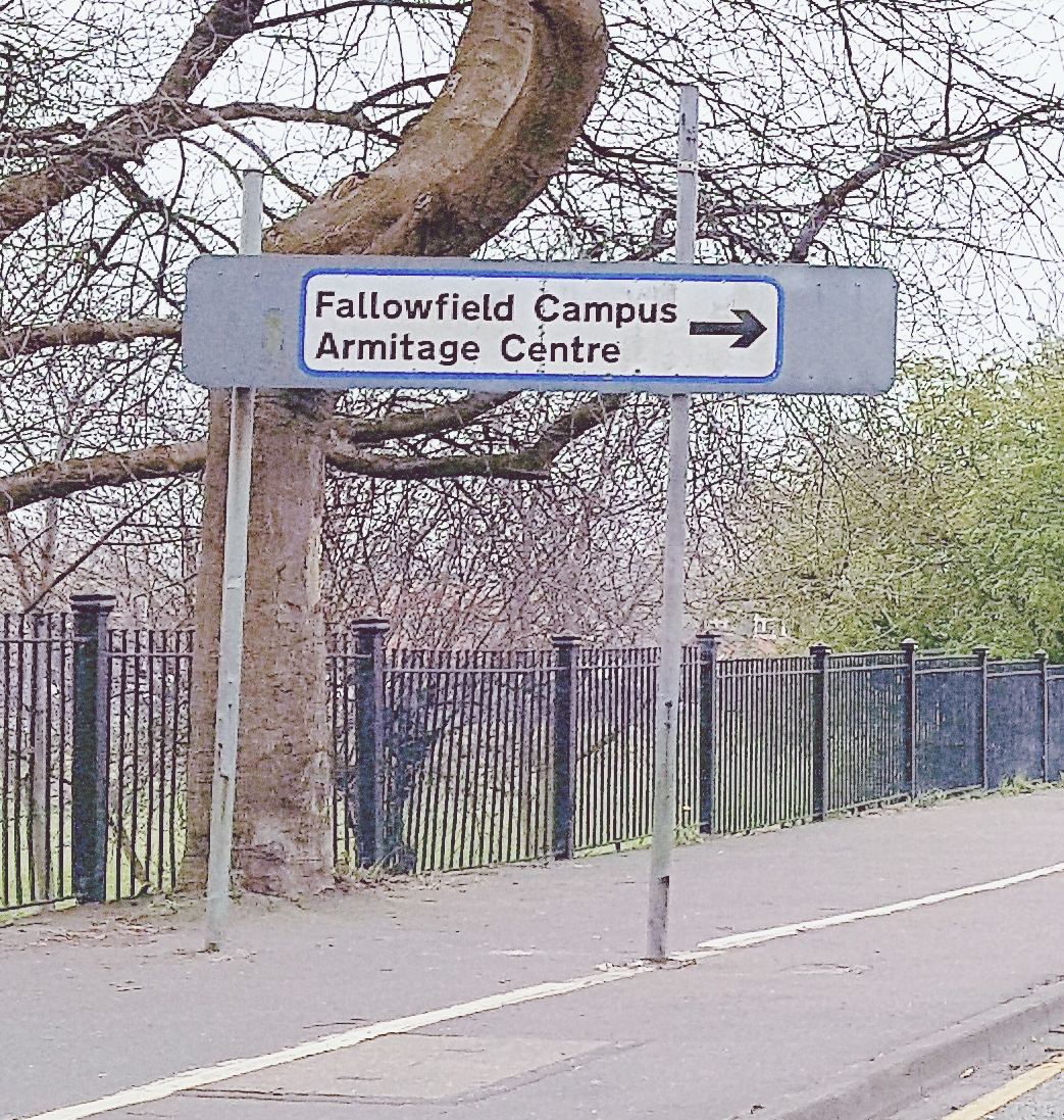
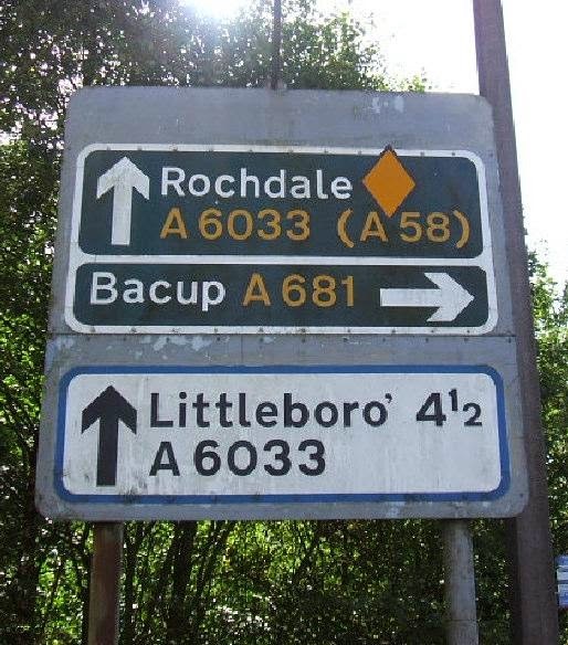
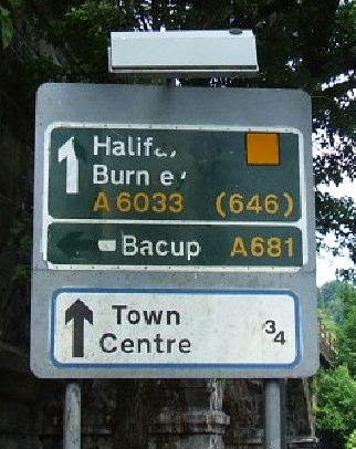
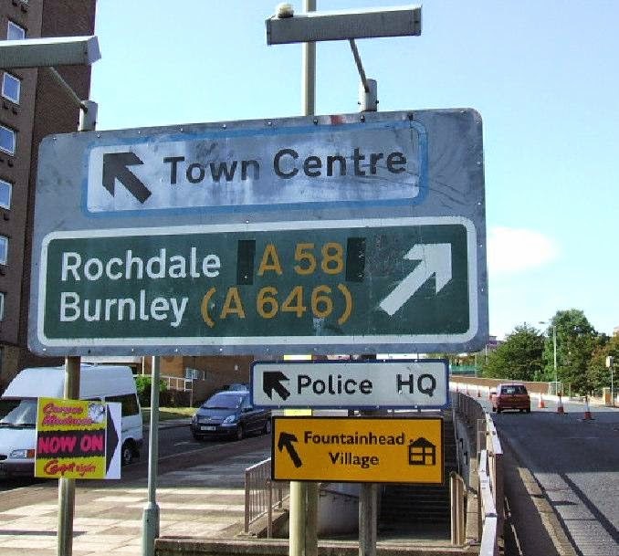
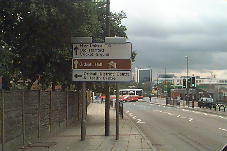
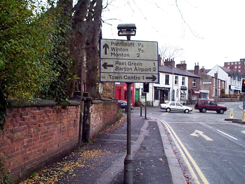
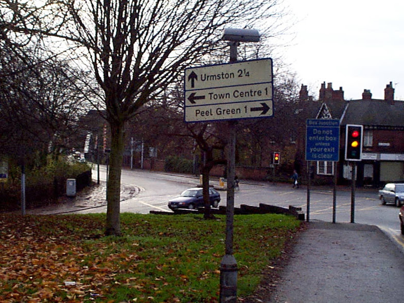
I really liked the big blue borders, so I have scoured the internet to find many examples to show you. The first three images are my own, the rest are by others, and many of them have since been removed.


The 1964 publication, Informatory Signs for use on all-purpose roads, has some detail regarding the appropriateness of local direction signs.
The key points were that local advance direction signs should typically follow the ‘stack’ format unless circumstances dictated otherwise. In London, for instance, where complex junctions existed, thick blue bordered map type signs were frequent. They also appeared as supplementary signs for the relatively new underpasses and flyovers that almost became commonplace across the capital.
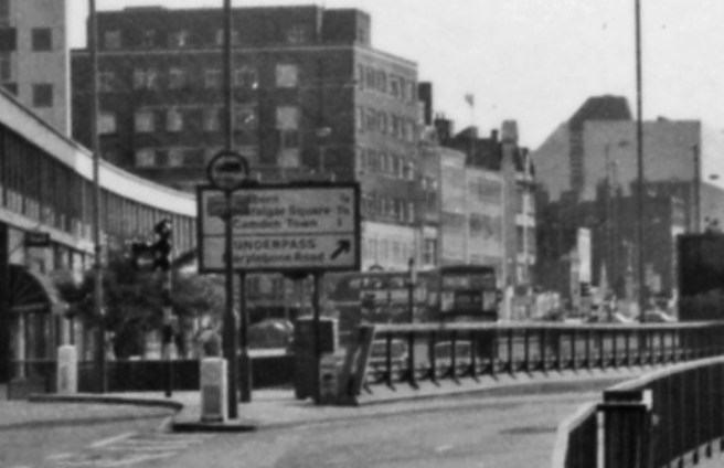
A large 1964 specification local direction sign at the entrance to the Euston Underpass, unhelpfully placed behind a regulatory sign on a lighting column. Photo Credit: Ben Brooksbank

Map type blue bordered signs, all post-1975 examples.
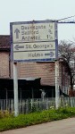
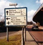
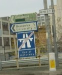
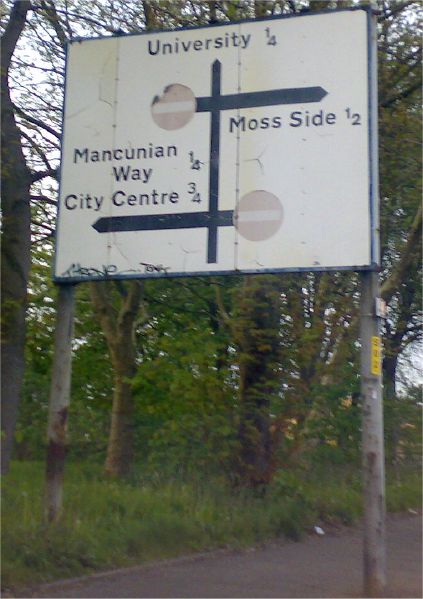
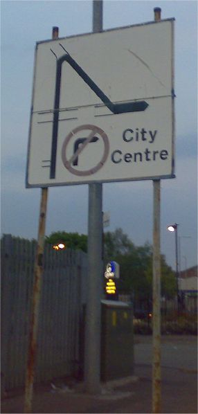
Meanwhile, up north in Manchester, the city’s engineers had a dilemma regarding the overhead signing on the elevated Mancunian Way. The 1964 TSRGD allowed overhead signs on motorways only, and at the time, said road was not one. Its designers therefore had to go rogue and develop their own standards, and they ensured that they appropriately dealt with their local destinations. Somewhat unwittingly, this paved the way for the modifications to all gantry signing that found itself being prescribed in the 1975 TSRGD. The Mancunian Way itself later became a motorway, and found itself being unique as the only motorway in Great Britain to not use blue signs – simply because it was just too expensive and unjustifiable to replace fully serviceable signs so early on, so the gantries ultimately limped on until the late 1980s. Today, very, very little remains of that original signing system, which is a shame as the current system is a complete mess in comparison. However, if you know where to look there are still some hangovers, in particular a thick blue bordered sign pointing to “St Peter’s Sq.” positioned above a pedestrian subway ramp as part of the construction and thus very difficult to remove…!
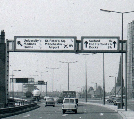

Manchester’s non-conventional local direction sign use in action. Photo Credit: (top) National Archive, (bottom) Sci.Eng.50
By 1975, it had been decided that the thick blue borders were not needed. There is no easily accessible evidence (at the time of writing, anyway) for why this change occurred when it did. However, it did mean that local direction signs had lost the one thing in their favour; the distinctiveness. From a distance, especially when earlier materials tended to fade somewhat, working out if a sign was indeed a blue or a black border became more difficult.
Comparison of the 1964 thick blue border with the 1975 thin blue border contrasted against each other and against an identical sign with a black border.
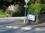
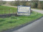
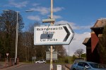
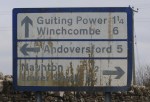
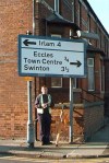
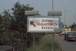
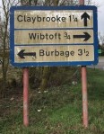
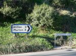
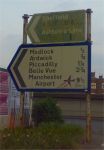
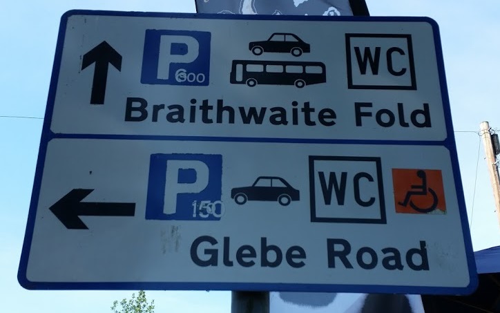
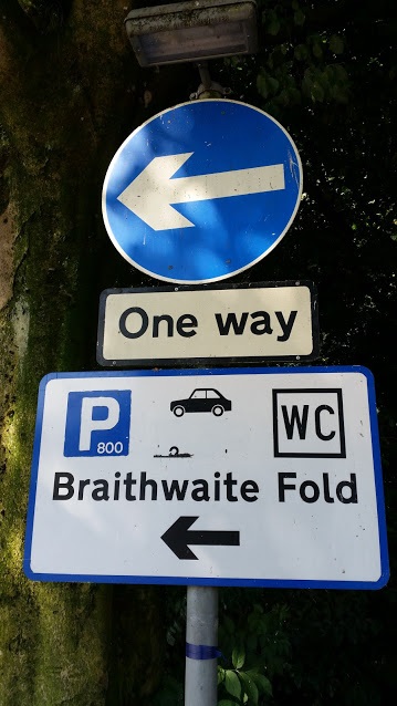
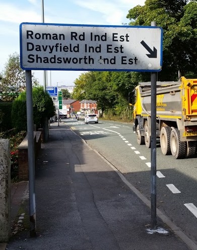
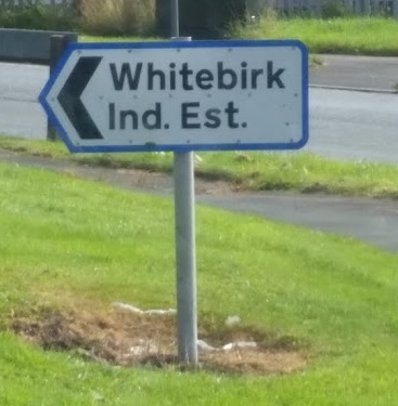
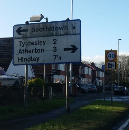
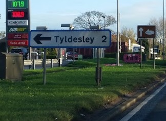
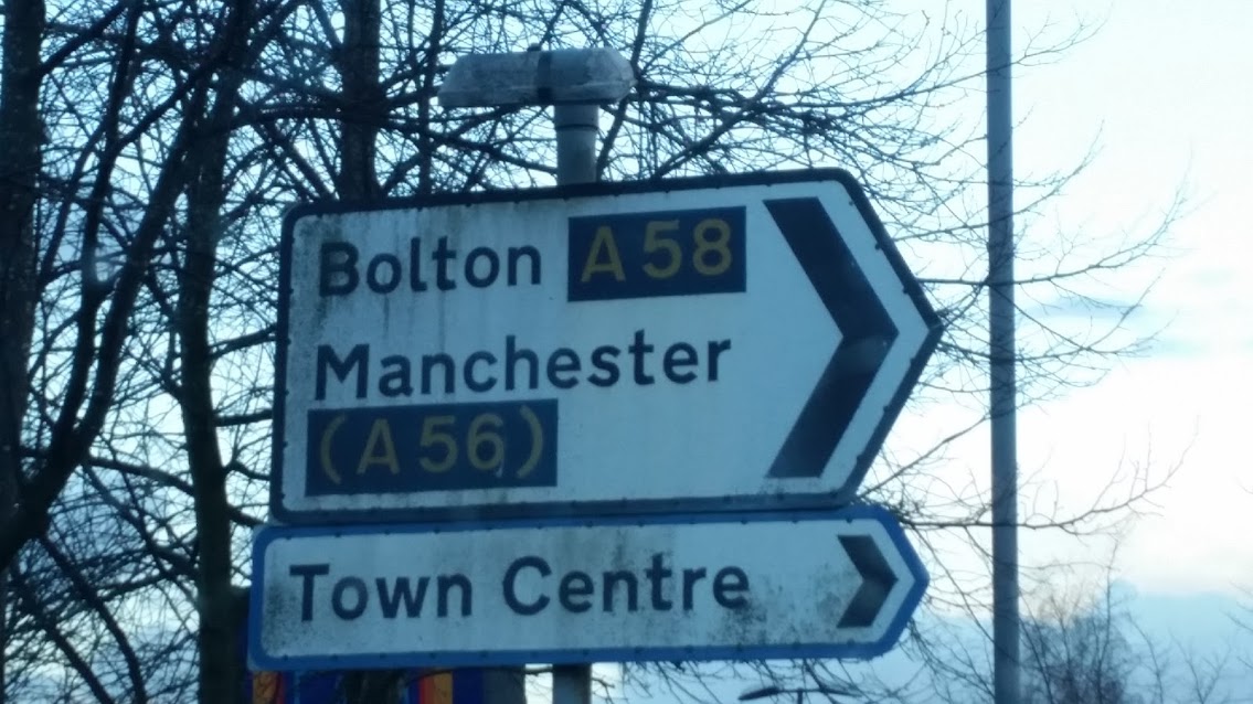
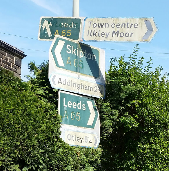
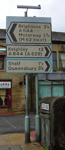
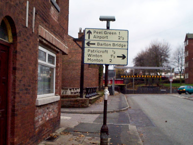
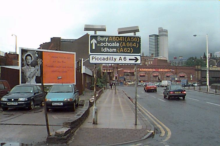
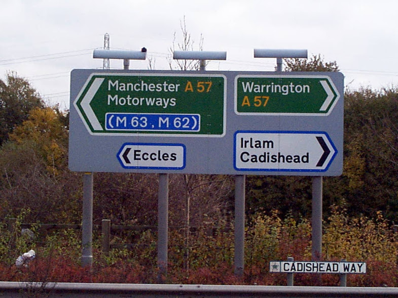
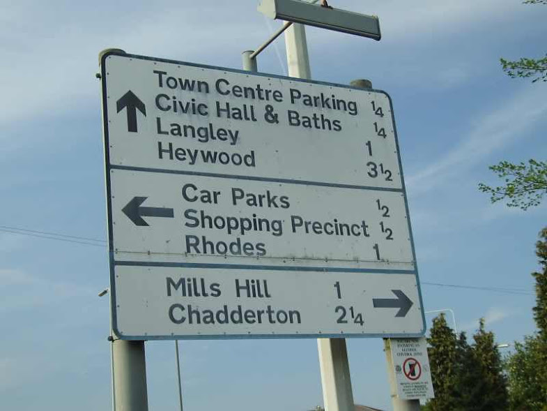
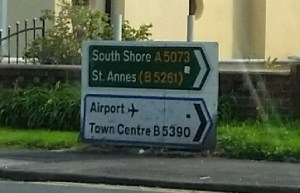
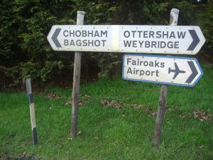
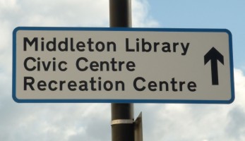
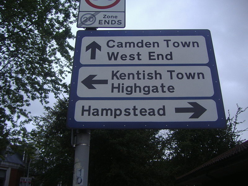
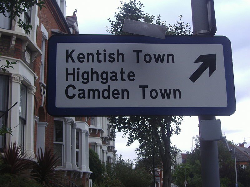
It is much easier to find thin blue borders, but here are some samples.

Airports, oddly, were always considered a local destination right up until 1994. This causes no end of silly situations where what are clearly major destinations in their own right were supposed to be relegated to the second set of signs at a junction. LTN 1/94 would eventually determine that a select few airports were to become primary destinations in their own right which ended much of this silliness. All other airports would use black borders and often became parts of the main sign at junctions.
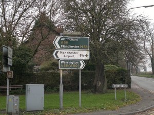
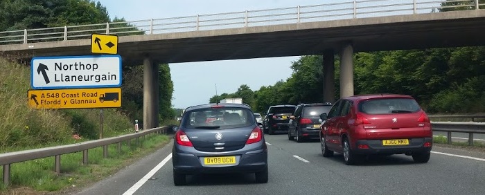
Post-1975 examples start to show the unravelling of the system. The signs were starting to be used for situations that could not really be justified as a ‘local destination’ at all. A notable example was the use of blue bordered signs on the approaches to motorways. This was never the intention of blue bordered signs. This is where black borders would have been acceptable, because if a destination is via a motorway it probably doesn’t constitute ‘local’ in the truest sense of the word does it!
Another issue was one of clarity at night time. Originally, direction signs in street-lit areas needed to be directly illuminated, but as the regulations were gradually relaxed this posed a problem. Under SOX lighting, which was prevalent in urban areas until the early 1990s, everything tended to suffer from being given a washed out yellow glow due to the way the light emitted from SOX lanterns behaves. This rendered the colour distinction virtually pointless on many signs. This was not helped by earlier sign materials being subject to degradation and the blue borders turning closer to black.
The final nail in the coffin, though, was simply that designers and drivers did not understand the signs. Their application was widely inconsistent across local authorities, and the drivers were not mostly aware of the presence of a blue border; they were looking for the destinations, not the borders on signs. Research during the Guildford experiments in the late 1980s concluded less than a fifth of drivers understood the system. This was its final downfall, and the signs were meant to be removed by 31 December 2014, some 20 years after the last new signs should have been installed.
That deadline has been and gone and most blue bordered signs are only removed as part of bigger schemes. Local authorities are too short of cash or just do not see the need to pursue an active policy of taking them down, much like in previous situations when sign savings expired (1 January 2005 for pre-worboys era direction signs, for example).
Then at the other end of the scale, there are those horrendous examples of replacing like for like without any regard to changes in the signing regulations; all three of the following examples were installed in the 2000s!
All in all, the blue bordered signs should be nothing but a memory by now, but they still live on. I do like to document them as, with other signs that vanished off the face of the earth, it becomes very hard to find actual images of them in use.
You will note I have not mentioned Runcorn’s bizarre ‘commerical areas’ signing, or the complex system used in Devon, both of which still rely on using blue borders but not in the traditional manner. That’s for another article at another time.

Very good, thanks.
LikeLike
Interesting read. i found this while researching blue bordered signs. Regarding the 3 pics of the ‘thick’ bordered signs around Hulme in Manchester. One of them has already been replaced. And it looks like the others will follow as they are installing a new cylce way in the road.
LikeLike