An unfortunate requirement of the sudden resurgence of the use of tactical diversion routes in 2009 was that thousands of signs had to be amended. Given this work took place as one of the worst financial crises of recent times was hitting, it was never going to be a scheme with a lavish budget thrown at it.
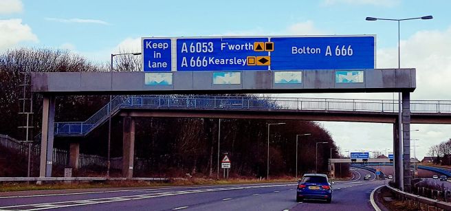
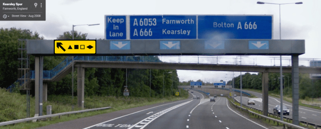
Here’s an example of what happens when cost considerations result in design problems. Firstly, if you are unfamiliar with the location, it is where the M61, the secret A666(M), M60, and A666 all bang into one another at the northern answer to Spaghetti Junction as shown on SABRE Maps. M61 Junction 3 forces all traffic directly onto the overloaded Kearsley roundabout, meaning there is no direct access from the southbound M61 back onto the A666 towards Bolton. This in itself has brought about some sign oddities in itself, such as the “Keep in lane” sign on the gantry. Incidentally, the solid white lines are often ignored by people who simply must get home before you do, causing a few sudden lane changes and panic braking episodes.

This style of sign replicates the original from 1970, when there was no guidance for overhead signs apart from a single diagram in the 1964 TSRGD. At the time the Ministry of Transport were determining how best to deal with the rapidly evolving motorway network which had more complicated arrangements than a simple lane drop to contend with. Image from Google Street View, 2008.
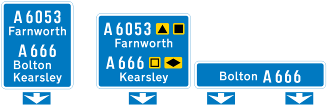
This sign is interesting in several ways; firstly, it utilises a consistent height across all component parts. In the late 1960s, this seemed to have been the then accepted practice. For example, the M4 Chiswick Flyover had similar, where instead of relying on backing boards, the unused space was taken up by blue background instead. When backgrounds were not reflective, and only the lettering was made from Scotchlite, this was OK. In today’s world where R3B (and greater) microprismatic materials would undoubtedly be employed, cost considerations you’d use grey backing boards where there is redundant space.
I’ve already covered the reason for the odd “Keep in lane” sign, which could be avoided if there was physical segregation between the flows (again cost versus lack of accidents – remember a near miss is not considered a cause for action when budgets are stretched to the limit). It doesn’t make clear if the requirement is for all lanes or just the left hand one, or for what distance they wish you to keep in lane. All in all, it’s one of those instructions that generally gets ignored.
The positioning of the downward pointing ‘get in lane’ arrows, separate from the main sign, is a result of the introduction of electronic motorway signalling. On urban motorways (of which this was not considered to be one at the time), they were mounted every third of a mile or so on overhead gantries. Where there was no requirement for these, the cut outs in the gantry fascia were replaced with the arrows instead. This stuck, and is partly why motorway signs even today still use separate arrows to the main sign – although the recent Interim Advice Notes from Highways England have shown you can go back to using a single sign assembly with arrows inside the main sign, as per the original 1964 TSRGD, once more.
It’s also worth noting the gantry, one of quite a lot in the North West of England (and until recently the West Midlands), is straight out of 1970. At the ripe old age of 47 years old it still proudly stands there, but that is actually a mixed blessing. When the gantry required updating to provide diversion symbols, it should have been simple to replace the entire sign face assembly; after all it’s been there for over 20 years. That did not happen, instead, the gantry today looks like this:
 What happens when cost considerations prevent you doing a brilliant job.
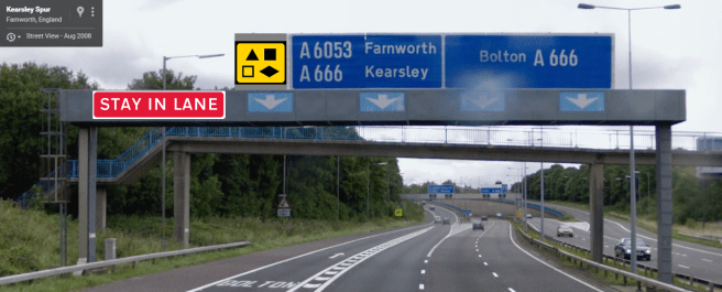
There are a number of design issues to consider with this;
- The requirement to place the diversion symbols has meant space must be found for them. This has caused the legend “Farnworth” to be abbreviated to “F’worth”, and “Kearsley” to be moved across.
- The assembly now looks extremely untidy as a result.
- The retro-reflective class of the original sign is wildly different to that of the new cover-plates, meaning at night time you cannot properly interpret the information due to being drawn to the ‘brightest’ part of the overall assembly.
- The downward pointing arrows have degraded somewhat in the 9 years since the Google Street View image (above) was taken which routine maintenance should really be addressing.
So, why wasn’t a new sign erected? Well, it’s simple – to do so means ensuring that the structure can withstand the new level of wind loading. If we take a more orthodox sign design for this location:
I’ve not put a grey backing board on this for clarity, and also because that would be the deciding factor in a lot of the following points.
There is now a sudden increase in height on the exiting lanes. That means, if installed, the wind loading capacity of the entire gantry would be changed. On a 47 year old structure this could be catastrophic. So, a simple job costing several hundred quid (and the bulk of that is the traffic management required!) would now suddenly ramp up to a job costing hundreds of thousands. Gantries aren’t cheap in the slightest.
That said, modifications could have been made to the existing sign face without losing the message. By cover-plating the odd “Keep in lane” message, relocating that to the gantry cross beam, the diversion symbols could have taken the space left without upsetting the wind loading of the overall structure. Alternatively, the symbols could go on the cross beam and the “Keep in lane” message left in situ.
Two possible modifications to the existing gantry that do not cause changes to the wind loading of the structure. There could be a potential maintenance issue with the sign mounted to the cross beam, but as it is over the slip road from M61 junction 3, you could close this overnight and not bring about the immediate end of civilisation!
The alternative option, then, of simply patching the sign will have to do. However, you can guarantee that there won’t have been an as-built drawing for this sign so dimensions will have been subject to a best guess. This means there’s an overlap of cover-plates and existing sign boundaries. It is a mess, but a sad reminder of what not having an adequate budget does to a scheme.
The alternative to a new gantry, modification to the cross beam, or what actually happened, would have been using conventional post mounted signs. There is not a vast number of HGVs that would obscure a sign on the cutting slope of the Kearsley Spur, after all, even under a diversion condition.
A possible conventional post mounted sign, rather than untidy modifications to a gantry.

Another solution is to stick extra signs on the left hand strut:
https://www.google.co.uk/maps/@54.6030558,-5.9206333,3a,75y,95.02h,105.8t/data=!3m6!1e1!3m4!1sitpHZa-ABjUnOLNz1OEjpg!2e0!7i13312!8i6656
Allowing for sighting and central reservation space, you could duplicate the diversion symbol panel on the right hand strut as well.
I have to confess I like the white space around A666 Bolton – the shorter panel seems a bit squashed to me.
LikeLiked by 1 person
The design choices made due to budget constraints highlight how important funding is to creating clear and effective signage.
LikeLike