*The punny title is the work of Johnathan Randall of Motorway Services Online. Blame him.
As you may know if you follow the infrastructure news, the first piece of the A555 (SEMMMS, or MARR to use its Sunday title) extension jigsaw opened this week. This was the short re-alignment of the A6 at the eastern end just south of Hazel Grove.
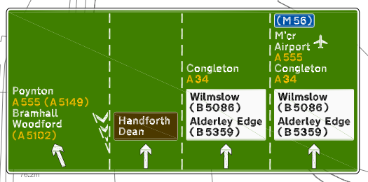
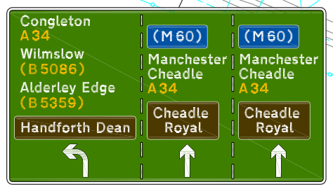
Unfortunately, with it some of the less than adequate traffic signs designed for the road have also appeared.
Stockport Council Planning Consent – A555 Mainline Signing Proposals
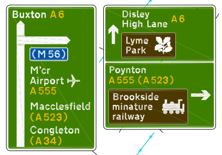
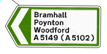
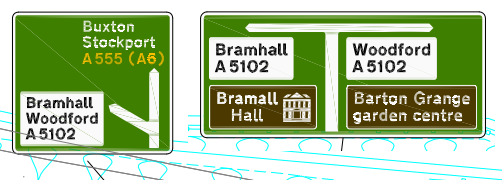
The above link shows everything that is proposed. I simply have not got the inclination to address each individual sign, as every single ADS shown on the plans has some type of design error. I have, therefore, taken some of the worst offenders and given an example of a hopefully better design. These are below.
Where do these signs go wrong?
Firstly, information overload. Destinations are duplicated needlessly, routes do not necessarily follow the most logical paths to take, and the overuse of information means the signs are ridiculously tall.
Second, the signs treat the A555 as an entirely local road, meaning that more strategic destinations are completely eschewed in favour of small suburbs and villages dotting the corridor rather than the actual major primary destinations at either end.
Third, the design faults are numerous. It is genuinely as if someone has sat down with Chapter 7 and done the exact opposite of what it says. It would, however, be grossly unfair to blame the designer alone. They may not be signage practitioners, simply thrown onto the job because ‘it needs doing ASAP’; and where planning applications are concerned, anything is better than nothing.
The real blame needs to lie with whatever Quality procedures are in place; clearly whoever checked the designs had not taken the time to address the errors or question why things has been done the way they were. The lack of knowledge, or simple lack of caring, at higher levels of the ‘command chain’ is the real reason that signage practice is in the shocking state it is today. Unless this changes soon, we can continue to look forward to major highway schemes being left looking rubbish due to poor signage.
There are also major safety implications. Poorly designed highway signs are likely to increase the risk of a collision as drivers may have to slow down to read them, or be distracted enough to leave the carriageway. A driver must assimilate the information within three seconds at most, therefore simple and clean design is essential for both information and safety reasons.
 There are even spelling errors on the proposed sign schedule. Checking clearly has not been properly done before drawing issue.


The design of lane allocation signs is much simpler if the permitted design rules that allow you to group lanes is followed.

23 years since LTN 1/94 was published, this type of error should be beyond sign designers.

The rules for slip road signing on all-purpose roads are 23 years old too. It should not be difficult to get them right.

Even my proposal is most unsatisfactory. Quite honestly, this is the type of location where a gantry should have been used – the planning application shows a gantry for the opposite direction.
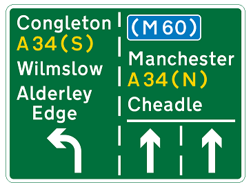
Rationalisation of destinations is a bonus. The tourist information should be on a separate sign in this instance.
But the A555 is not the only place where this absolutely lacklustre approach is evident. I assisted with a Road Safety Audit for a major junction in Newcastle in 2015. The proposed signage had all the same problems as the A555; too many destinations on a single sign, poor layout, and the risk of causing distraction and collision to drivers. All of our recommendations were ignored.
Apparently the sign on the left is perfectly adequate, even at 30 mph. Really? My suggestion on the right was more economical in terms of space, presentation of information, and compliance with the TSRGD and TSM.
The major consultancies need to get to grips with sign design, and fast. These mistakes keep happening, are not being checked properly, or just ignored by people who don’t know what they are doing, and the highways industry is being adversely impacted as a result as we are made to both look incompetent and unprofessional.

Ye gods, some of those signs are horrific.
One thing surprises me, I thought that on secondary signage it was usual to omit the road numbers if they had previously been shown on the primary signage. Is that no longer the case (or was it never the case)?
As an aside, I hate the abbrvtn M’cr for Manchester Airport. If there isn’t space to write it in full, I would rather just see “Airport” with the plane symbol, it isn’t as though anyone is going to be confused about which airport it refers to.
A further suggestion for the 3 lanes ahead junction would be to show all three lanes ahead to Airport, Congleton and Cheadle, and show Buxton (A6) on a right fork, something like this: http://getdown.org.uk/sabre/a555-a6.png
LikeLike
The international airport code is MAN, as printed on the tickets, etc. It’d make more sense to use that, all in upper case, than silly anglicised ‘abbreviations’ (contractions) or ambiguous descriptors duplicating the symbol. Similarly every airport in UK. Recognition by departing travellers is, or ought to be, a more important consideration than the aesthetic sensibilities of the native designers or sign geeks. Sorry about that! I’d even argue for the same in countries with a non-Latin alphabet—and recommend the Transport typeface for it, too.
As for the labyrinthine regulations and guidance being apparently too-difficult for designers to consistently follow: ‘Great Britain¹ is widely acknowledged to have one of the best traffic signing systems in the world’, allegedly 😒. Just keep repeating that to yourself and it’s bound to come true, eventually…
¹ :- But not Northern Ireland?
LikeLike