This article is inspired by a conversation that occurred on the Facebook page for the Society for All British (and Irish) Road Enthusiasts about examples of pedestrian crossings using the wrong sign.
I set about asking myself ‘how could we improve things’?
The humble Zebra Crossing is a rather elderly innovation these days. However, it is still an extremely versatile means to provide a safe way to cross the street in urban areas. It is therefore imperative that the associated signs used with such a facility are appropriate and fit for purpose.
The current Dia. 544, for use on the approach to Zebra Crossings only, is often misused or inappropriately placed. This is often due to simple misunderstandings about its function. For instance, it is not necessary to place the sign prior to every single crossing. If visibility is good then a sign is pointless and a needless maintenance liability.
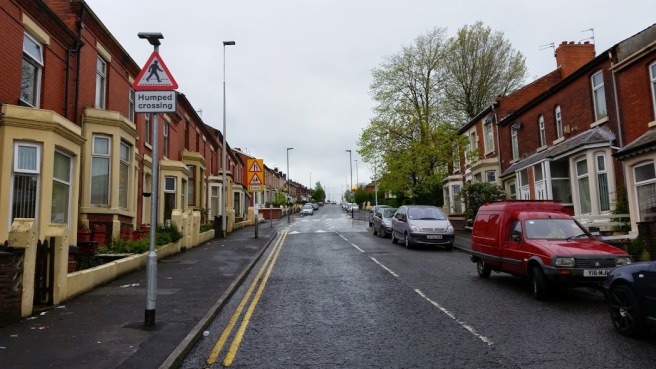
The above Dia. 544 with supplementary plate is appropriate, even though at first glance it may seem to be overkill. The road here is on a continuous uphill gradient and the rise on the humped crossing is therefore masked by the visual distortion of the road ahead the hill causes. However, the warning of a school crossing patrol in the distance would be better as its own sign – the warning of road narrows is not needed on a road where parked vehicles narrow the carriageway anyway.
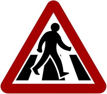
My criticism of the sign is not just the overuse of it, but the fact that the pictograph does not even adequately represent the Zebra Crossing. Prior to the early 1950s, pedestrian crossings comprised entirely of two Belisha Beacons and a parallel pair of studs to demarcate the crossing point. This was felt to be insufficient, and the now familiar painted stripes were introduced.
In 1963, when the Worboys Report was issued, the sign for a Zebra Crossing still showed such a facility as a pair of parallel studs. It therefore has never truly been representative, although the argument in its favour was presumably clarity of the pictograph of the pedestrian.
However, there is an argument for clarity with the rest of the European Union (even if the UK is most likely leaving it in the next few years). At least 18 of the 27 member states presently use the stripes variant, which is distinctly a super-majority of 66%.
The second argument is immediate recognition; the studs variant is often (technically correctly) identified purely as a ‘pedestrian crossing’, not a ‘Zebra Crossing’. This distinction in the UK will be more apparent further below.
Q--60_35")

The French replaced their symbol A13b with the striped crossing variant in 1998. I am not ashamed to say that on a trip there in the late 1990s, when I first saw it, that this change actually pleased me.
The legal obligations of a motorist approaching a Zebra Crossing are currently that they need not stop unless the pedestrian has already stepped out onto the crossing. I don’t intend to open the debate on that issue (save for the fact I do have some sympathy for ‘priority should apply even to a pedestrian waiting on the tactile paving’ argument). By providing an obvious sign for this purpose the expectation that they may need to stop is emphasised. If a motorist thinks the sign is generic, they may not be expecting a sudden ‘claim of priority’ by an exasperated pedestrian!
There is also the third issue of the new “Parallel Crossing”, which is perhaps better known as the combined Zebra/cycle crossing. These are, presumably, still to be signed as a standard Zebra Crossing, which would once more further the need to ensure the sign is distinct and recognisable.

A complete dog’s breakfast of an installation is shown above; the supplementary plate is not needed and the temporary sign is in the wrong place too. In all, this suggests even designers think there’s a problem with understanding the plate.
I have looked at the European stripe designs, and the main criticism of the bulk of them is they draw too many stripes. I have therefore drafted a design which reduces the number of stripes to just three.


Proposed Dia. 544A which would allow the eventual withdrawal of the current Dia. 544. This sign would be appropriate for use at Parallel Crossings (a supplementary plate would be advised for such scenarios) as well as regular Zebra Crossings.
The second issue is the dreaded at-grade crossing on a high speed road. These, personally, are something I wish did not exist at all, but in a world where value engineering is king, providing footbridges or subways is not always viable. These crossings are only visible in many cases because of the warning signs on the approach. Modern design specification requires guard rail and such like to make it obvious there is a crossing point but there are still many older sites where the only protection afforded to a pedestrian is a gap in the central reservation barrier.
Presently, such sites are required to use Dia. 562 “other danger” with a supplementary “Pedestrians crossing” plate. This is in itself an issue as a crossing pedestrian should not really be relegated to the same category of other danger.

A temporary, and incorrect, installation of the uncontrolled pedestrian crossing point sign.
I personally would like to see a standard pictograph of a pedestrian crossing the road ahead. Doing so would emphasise the presence of such a crossing point and ensure that there is no confusion as to what situation exists ahead.


Proposed replacement for the existing Dia. 562/supplementary plate combination. The pictograph makes it clear the pedestrian is crossing despite the lack of a controlled facility.
I don’t know if there is an actual utility in promoting this concept as an actual idea to take through to research and further development; I rather suspect the DfT is wanting a break from traffic signs following the recent rush to ensure the TSRGD and Traffic Signs Manuals are all amended.
Summary
The advantages of proposing a change are thus:
- Replace a slightly ambiguous symbol with a clearer one.
- Promote standardisation with majority of neighbouring European nations.
- Provide advance warning of uncontrolled crossings using a bespoke sign rather than a generic ‘other danger’ plate.
- Improve road safety by ensuring motorists are not ‘surprised’ by a different circumstance through the use of an incorrect sign.
The disadvantages are:
- Cost. To mitigate this, it would make sense to have a phased replacement as is happening with imperial only regulatory signs and then withdraw the existing Dia. 544 and 562/plate combination after so many years.
- Potential for confusion. This could be mitigated by a simple education campaign, although this again incurs a cost.
- Need. Further detailed research may suggest that such a change would provide only superficial benefits, as was discovered during suggestions to introduce strike-through red bars on No Pedestrians and No Cycling signs. The increase in comprehension (which was already in the high 90% range) was negligible.
It’s a suggestion I would like to see at least considered, however!

Great proposal for having no more than one pictogram for walkist in warning signs (triangle argent bordered gules). Am totally unpersuaded by DFT's ideological opinion for having alternative ones for frail/ elderly/ children/ adult+child, etc. That can't really be described as a position backed up by credible research. Would also like to see the same consistent pictogram applied to positive instruction signs (circle azure). Your proposed pictogram for zebra is wonderfully clear and legible from a distance. I think Margaret Calvert would approve of all this—ISTR her lamenting in an interview the bloat and mission-drift that has crept into the signs over recent decades.
Could I also suggest replacing the words ‘Parallel’ and ‘crossing’ in your proposed subplate with pictograms for rows of studs, possibly beefed-up to elephant footprint size and with the same sort of perspective treatment as your zebra? My response to the TSRGD 2010/5/6 consultation called for those road markings to be full-width alternating yellow and black stripes, because I have no confidence that motorists will honour them otherwise—the subplate could have used the same pictogram in that case.
With your rationalisation proposals and mine, ‘cost’ should be moved into the ‘advantages’ list as it results in fewer designs to draw, maintain and legislate for and less opportunity for clutter on the ground. It can't be a disadvantage compared against the hundreds of [wordy] new signs in TSM chapter 8 part III⁄N. Sadly, I suspect DFT have no interest in upping their game at all! 😦
LikeLiked by 1 person
Thanks for your comments, Mark.
I can see the logic in having the school symbol as young children can be extremely unpredictable.
However, the elderly persons sign is a bit of a condescending symbol; it’s interesting that the original supplementary plate of ‘Elderly people’ was binned off a long time ago so the meaning could be expanded to also mean disabled people in general provided you had a plate if specifics were needed.
What bothers me most is that motorists are in such a rush that a less able pedestrian needs to be considered a much more serious hazard because they won’t be able to dive out of the way.
Any pedestrian in the road is a ‘hazard’, although I am sure many engineers would state it is actually the moving vehicle that is the hazard (and I wouldn’t disagree, a big metal box should not be king)!
I would have loved to see much more innovation within Signing the Way but it seems that much of the initial enthusiasm was lost when certain politicians got involved and decided to use it as an opportunity to beat civil enforcement with and undermine its entire purpose.
LikeLiked by 1 person
Yes, good point—also playgrounds. I read somewhere that the children pictogram was based on an actual photograph of a young Margaret Calvert (and her brother?). If you really want to put the cat amongst the pigeons, add a circle to represent a ball being chased! 😮 She also suggested the elderly pictogram looks like extra-terrestrials. I still think the number of pictograms can be reduced and consolidated with those on corresponding prohibition roundels, positive instruction circles, motor traffic lights, information signs etc.
Returning to your point about research on recognisability of signs, you tend to get the answer you want by loading the questions. It's not just motorists in a rush you need to be bothered about. If I were given £1000 for every motorist encountered who is utterly convinced that it's illegal to cycle past a diagram 950 sign, I'd be a billionaire by now: if they can't distinguish between a circle and a triangle, of course a different pictogram (or cancelling line) isn't going to make much difference. Although I note DFT's dismissal of 10 % and 13 % increases as unworthy…
Just as politicians stripped out innovation from Signing The Way, so too did the highway bodgers' guilds with cycling signage improvements during the ‘technical review’ of TSRGD 2015/6.
LikeLike
I’m not keen on the zebra crossing warning sign. When you need to draw a white outline around the person in order to distinguish it from the striped background, you lose a whole lot of clarity and recognisability – drivers will not see and understand the sign as quickly as the diagram is significantly more confusing and noisy. The existing sign is very clear.
And do we need a specific warning sign for zebra crossings as opposed to other crossings? Zebra crossings are already highlighted with bright orange belisha beacons (or “hore balls” as I think we should call them!) and a strongly contrasting road marking – once there has been a warning of an upcoming pedestrian crossing, drivers then need to be on the look-out for it and can see whether it is a zebra, pelicon/puffin/toucan or a non-priority crossing and react accordingly.
Adding an extra level of granularity to the sign detail is unnecessary, the design itself is unsatisfactory, and changing it adds extra cost, dramatically increases the likelihood of councils installing the wrong signs, and in the short- to medium-term, could make crossings more dangerous, as it would take years or even decades before all existing signs were replaced meaning that drivers might come to expect the “old” sign to indicate a non-zebra crossing long while there were still a great many unconverted signs still out there.
LikeLike
congrats!
LikeLike